Watercolor Trilogy Reflection (1-D): January 24, 2013.
1.) I thought that all of my trilogy pieces fit together nicely because I used a black cursive font over most of the page.
2.) I could have done a better job with the neatness of my paintings and having more creativity.
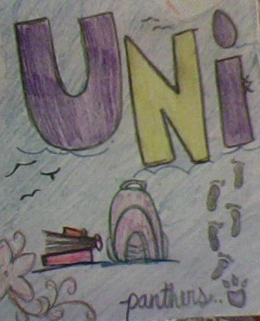
3.) My past is Ventura volleyball because that's what brought out my personality and go get em' attitude. My present painting was the family tree because right now I've been surrounding myself with my family more because I'm leaving for college soon, they've become even more important to me over the past few months. The future painting represents UNI because that's where I'll be at school next year and for a long ways to come, UNI is the start of my future.
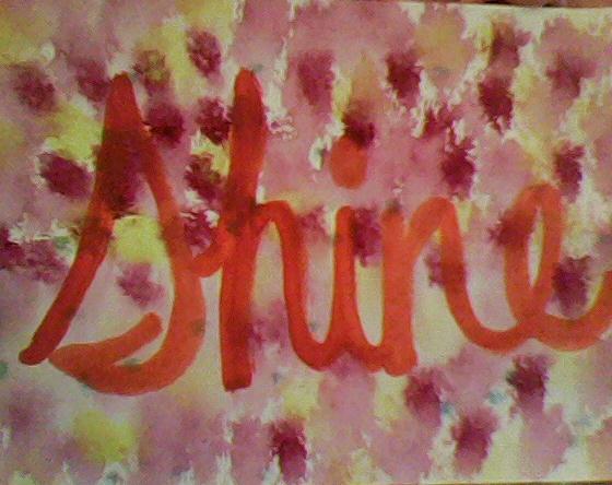
4.) The black cursive lettering in all of my pictures stands out and it's bold because my beliefs are bold and the cursive shows that my life is all flowing together somehow.
5.) Water color was bad, I actually really didn't like using it. I thought it was way too hard to make my paintings neat and to look how I wanted them to look in the end. But hey, it was easy to clean up.
6.) I learned that just like my pictures flowed together, so does my life and everything will come together even if it is a little messy around the edges. I also learned that the focus you put into your pictures is what will come out of it, if you don't focus on what you're doing you won't have a good result.
7.) I had my designs all ready before I actually painted them but then my visions changed throughout the process. So I just painted what I was feeling at the moment and applied it to my life and how it's effected me. I used different techniques like wet on wet or dry brush and I figured out which one I liked using the most. Then I put all of my paintings in order from past to present to future.
8.) I thought this was a decent first painting experement but I though more of direction on how to paint would've helped for a better turn out. I liked how I could be creative and just paint how I felt I should paint it but I'm a lot better with direction.
1.) I thought that all of my trilogy pieces fit together nicely because I used a black cursive font over most of the page.
2.) I could have done a better job with the neatness of my paintings and having more creativity.
3.) My past is Ventura volleyball because that's what brought out my personality and go get em' attitude. My present painting was the family tree because right now I've been surrounding myself with my family more because I'm leaving for college soon, they've become even more important to me over the past few months. The future painting represents UNI because that's where I'll be at school next year and for a long ways to come, UNI is the start of my future.
4.) The black cursive lettering in all of my pictures stands out and it's bold because my beliefs are bold and the cursive shows that my life is all flowing together somehow.
5.) Water color was bad, I actually really didn't like using it. I thought it was way too hard to make my paintings neat and to look how I wanted them to look in the end. But hey, it was easy to clean up.
6.) I learned that just like my pictures flowed together, so does my life and everything will come together even if it is a little messy around the edges. I also learned that the focus you put into your pictures is what will come out of it, if you don't focus on what you're doing you won't have a good result.
7.) I had my designs all ready before I actually painted them but then my visions changed throughout the process. So I just painted what I was feeling at the moment and applied it to my life and how it's effected me. I used different techniques like wet on wet or dry brush and I figured out which one I liked using the most. Then I put all of my paintings in order from past to present to future.
8.) I thought this was a decent first painting experement but I though more of direction on how to paint would've helped for a better turn out. I liked how I could be creative and just paint how I felt I should paint it but I'm a lot better with direction.
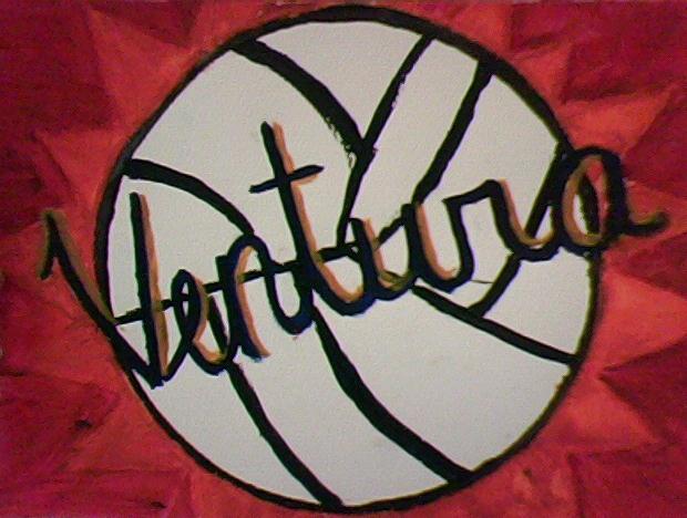
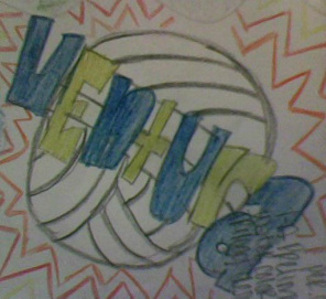
This is a picture of Ventura from my past, I chose to paint this because being on the varsity volleyball team was a huge part in building my work ethic.
|
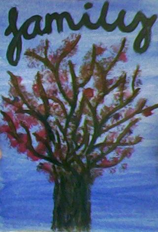
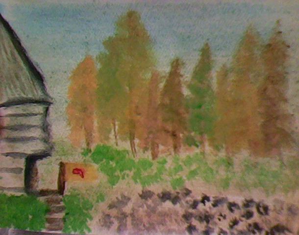
This family represents my present life because my family has become even more important to me now that I'm going to college soon.
|
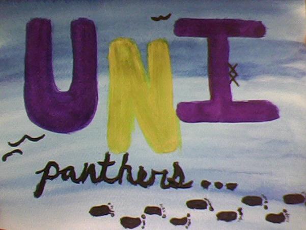
UNI is a picture representing my future because I got accepted to study there next year and it's going to build my whole future.
|